


Stationery Shopping in Chicago
and also eating, and drawing, and looking at art, and

In Season 2, Episode 3 of The Bear: Chicago-based Chef, Sydney orders a breakfast sandwich with longanisa, a hashbrown, mushroom adobo and a mango tart from Filipino restaurant, Kasama. I then travelled to Chicago specifically to recreate this breakfast outing for myself.
Kidding…(sort of), but I had an opportunity to visit Chicago for a few days, and spent time doing some of my favorite things in the city: eating, looking at art, and stationery shopping. In chronological order of visitation:
I want to visit cool, independent, stationery shops but I don’t live in Chicago!
I’m constantly updating my world map of independent stationery shops, which is always accessible via my website: journalingdan.com.
This post is the fourth in the series: Stationery Shopping in _____, a city-by-city guide.
Previous installments:
🥖 Stationery Shopping in Paris
🚕 Stationery Shopping in New York City
🌁 Stationery Shopping in San Francisco
🗺️ For an in-depth post about my stationery world map, click here.
But first…..breakfast
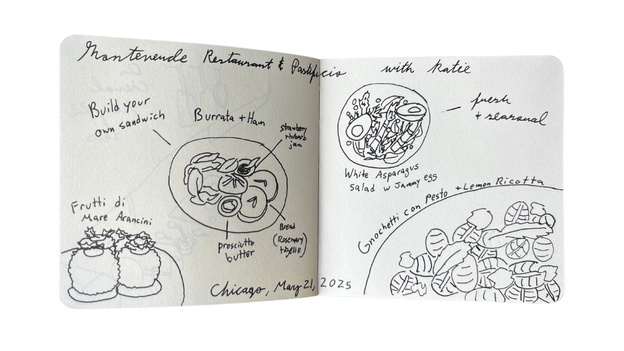
(Actually, dinner). You can’t talk about Chicago without talking about food, so our stationery journey really begins after landing at MDW and heading straight to Monteverde Restaurant & Pastificio for some fresh, handmade pasta. I took no photos, but instead made a sketch of the spread I shared with my friend at the Italian restaurant in the West Loop (below). I’m still thinking about the Gnochetti con Pesto, cut with lemon ricotta, the flavors impossibly light and fresh on the pillowy gnocchi. Aforementioned gnocchi pillows gave me a good night’s sleep for the next day, which started promptly at 9am (ish).
Sidenote: The latest YouTube video is up - an in-depth, up close look at how I travel journal, + how I set up the little sketchbook featured in this post! Based on a previous Substack post: How I Travel Journal.
Kasama opens at 9am, but arriving at 9am on a Thursday1 is not early enough to avoid a 40~ minute wait2. I anticipated this, and as a person who lives in New York, am no stranger to lines, and was not deterred. I was on a mission. I read Amy Tan’s The Backyard Bird Chronicles3 to pass the time.
Breakfast is my favorite meal of the day, perhaps because it is a lawless meal. Anything goes. Breakfast does not obey the laws of time and space. At diners, it’s served at all hours. Breakfast menus are robust, covering all of the major food groups. You can start your day with a protein-rich omelette, fried chicken and waffles, a hearty bowl of warm oatmeal, a grapefruit4, breakfast tacos, a dinner-appropriate spread of biscuits and gravy, or with a dessert like pain au chocolat or french toast. If I’m not having decision paralysis at a restaurant over starting the day on a sweet or savory note, I’m ordering a breakfast sandwich: the cheeseburger of breakfast foods. It’s on most menus, a classic and comforting, American tradition. Like most American traditions, there’s a basic formula, with regional influences, culture, preference, or a restaurant’s signature shaping each variation. Often dressed down and served to-go in a foil wrapper,5sometimes served on a plate, with cutlery, the way an “elevated” burger might be. Fried egg, or scrambled, avocado, sausage, bacon, turkey bacon, American cheese, Swiss cheese, cream cheese, grilled onion, on a bagel, on a roll, on an english muffin, there is no wrong way to make a breakfast sandwich. Like a burger, it’s a menu standard, and one could argue, it’s just an egg sandwich (or a patty on a bun), but real burger lovers know that the multitude of ingredients, combinations, and preparation methods comprises each sandwich’s unique DNA.
Shake Shack inventor, and chef, Danny Meyer, on Be My Guest with Ina Garten, says (of the thousands of trattorias with nearly identical menus in Rome), “your favorite trattoria is two things: it’s [1] the one that loves you the most, and [2], the one that makes your favorite dish, the best.”6 This is the metric I use when people ask me for “the best” in New York, an impossible question in a city with more restaurants than one person could visit in a lifetime, I’ll lead with “my favorite,” instead. Kasama was my favorite restaurant visit in Chicago.
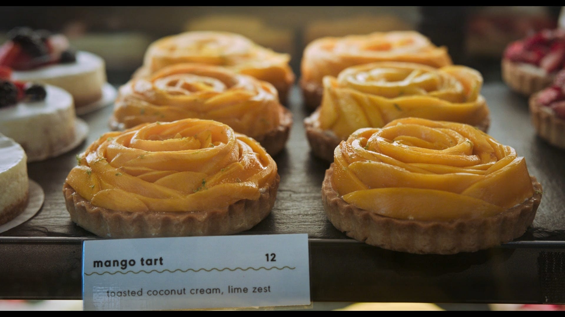
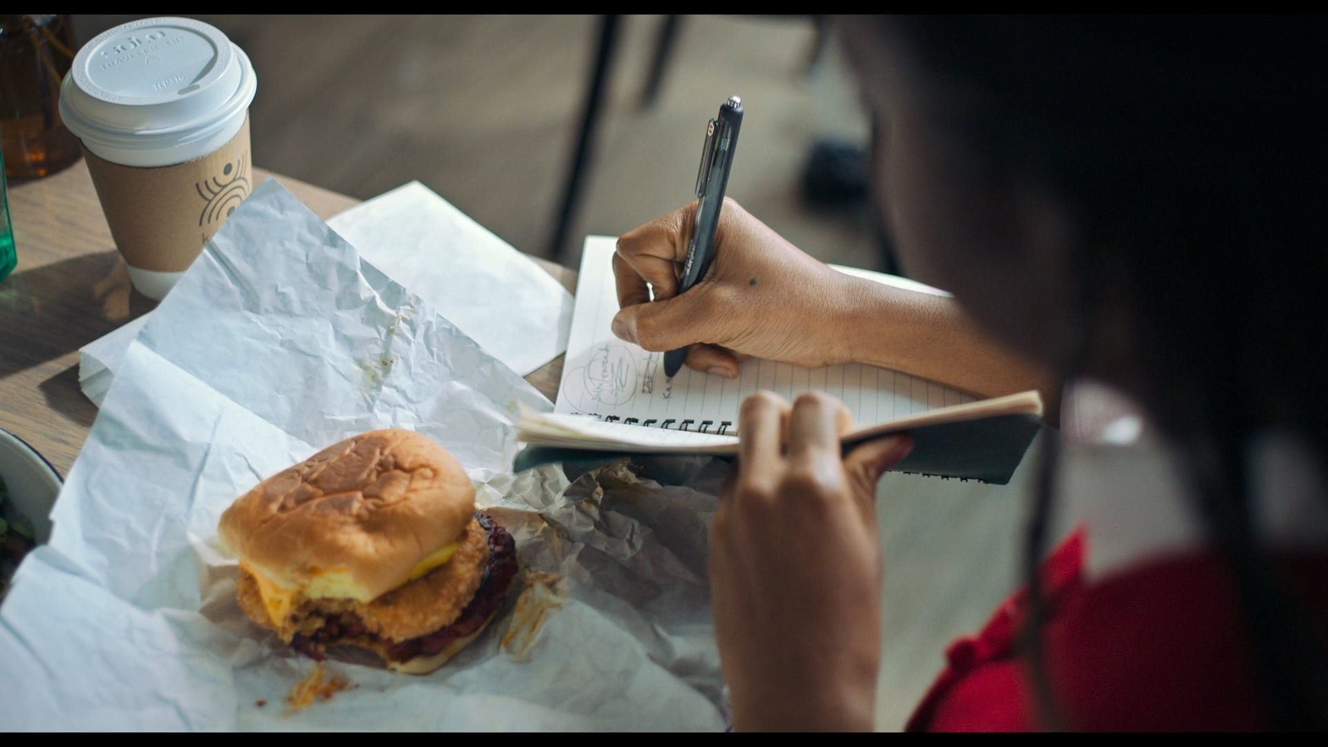
Forty minutes have passed, and I’ve made it to the front of the line. An array of pastries glitter in the display below the register, and I spy the mango tart of The Bear fame (starstruck!). I was worried I couldn’t house Sydney (of The Bear)’s order entirely, as a traveler with a packed itinerary, I can’t carry around leftovers all day. I trimmed the exact order from the episode to: a breakfast sandwich with longanisa, (very sadly skipped the hashbrown, in an effort to minimize food waste, I know my limits), and a coffee.
The sandwich: a fluffy, cloud-like patty of egg soufflé, cut into a perfect square, topped with cheese, and longanisa7, served on a potato roll, and wrapped in foil. The cheese was beautifully fused to the eggs, and the longanisa sausage was salty and flavorful, satisfyingly cutting through the milky, custardy-egg-patty. In short, it was perfect. I washed it down with an iced latte, a delicious drink made from Chicago’s own Dark Matter Coffee, and I soon realized I did have room for something else. Unsure if I had to wait in line again, I asked if I was able to order something else at the bar, and through my efforts, I secured the last mango tart of the morning. A two-course breakfast! (Lawless.) I tried a tiny slice, before taking the rest to-go, and floated away on a cloud of coconut pastry cream, ripe mango, and lime zest to my first stationery destination…..a twenty minute walk away.
Forgot this was a stationery blog and wrote several paragraphs about the glory of the breakfast sandwich. The stationery shop tour starts here: ⬇️
The Center of Order and Experimentation
📍 1727 W Grand Ave (West Town, Chicago)
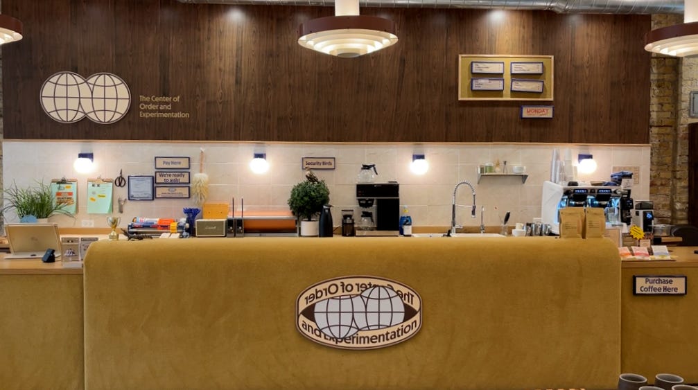
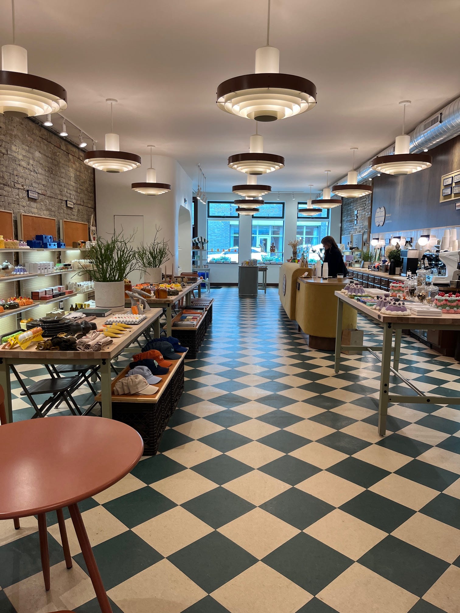
The Center of Order and Experimentation (COE) is not a cult!!!8 It is, an exquisitely outfitted retail and coffee shop. The interior design is a marriage between Mad Men and Severance. A retro-futuristic, mid-century modern, office space of sorts. A desolate-yet-charming, nostalgic-for-corporate, beige-but-not-boring aesthetic. The carpeted coffee bar is straight out of a Wes Anderson film, its symmetry and wood paneling a sight to behold.
Green checkered floors stretch through the elongated shop layout: a stationery shop in the front, a cafe in the middle, complete with tables and chairs, and unique gifts, plus a rotating curation of vintage clothing in the back. The shop, well, center, is a little of everything, a third place with a dash of world building, where one can grab a drink, shop around, and be inspired by the fantastic curation of products.
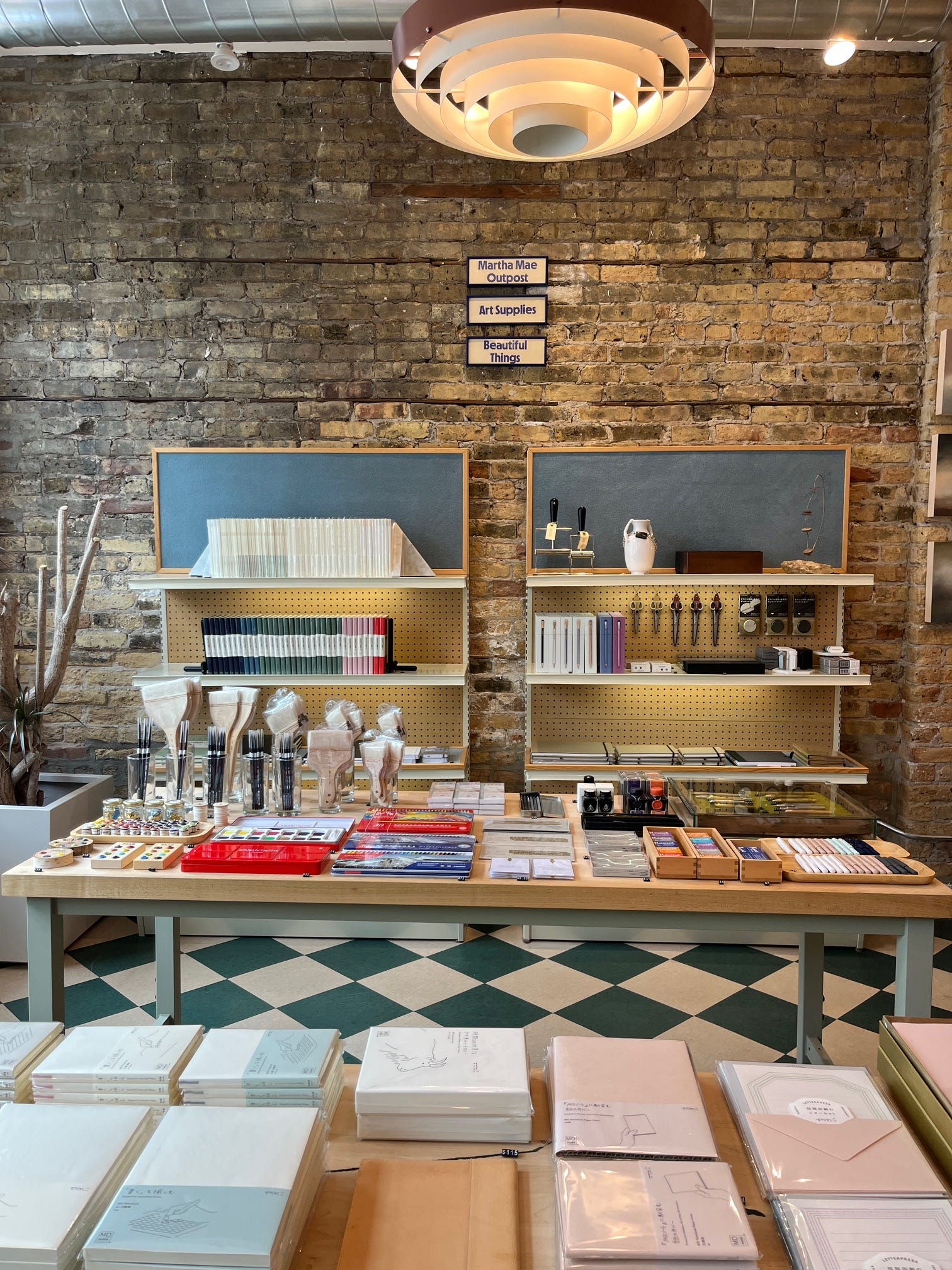
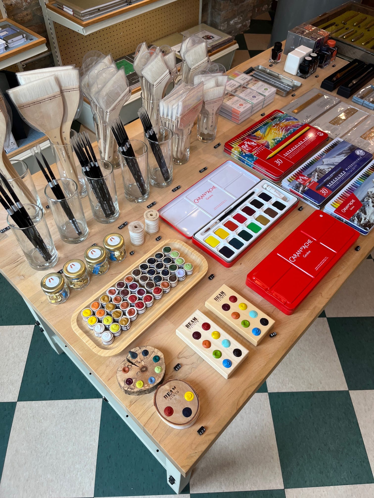
Behind the concept, as you may spy on the signs on the brick wall (above), is Martha Mae Outpost, a online shop run by Chicago-based artist Jean Cate, and named for her Cavalier King Charles Spaniel: Martha Mae. The Center of Order and Experimentation is the sister shop, housing a curation by Martha Mae, (short for: Martha Mae: Art Supplies & Beautiful Things). The philosophy, and guiding principle of Martha Mae is the belief “that the objects we use and handle daily can be beautiful while being useful….[which can] have a ripple effect on our everyday spaces and happiness.” COE allows this mission statement to expand beyond art supplies and stationery, extending to the other items sold in the back of the shop. Shiny Toyo toolboxes, design books, glassware, and uniquely designed kitchen tools are displayed alongside candles shaped like cheese, cakes, parfaits, and other desserts.
Because the founder of COE is an artist who loves design, I found the selection here to be particularly interesting. Objects are displayed in symmetrical, orderly, and satisfying arrangements. I had never seen Beam paints in person, and so was delighted to see the product range from the Indigenous owned and operated brand. The pigments are manufactured from family workshops in M’Chigeeng First Nation, (Manitoulin Island in Lake Huron), and are completely plastic-free. The watercolors are instead wrapped in waxed cloth when sold individually, or housed in a wooden palette. The natural pigments are presented within the context of their earthly origins, and they’re beautiful to see. That being said, I have no business buying more paint, and so didn’t leave with any, but part of stationery shopping is just looking around finding inspiration in beautiful objects! I picked up some COE merch in the form of stickers, a mug, and an orange Pigma Micron just for the hell of it.
Field Notes HQ
📍401 North Racine Avenue (Fulton Market District, Chicago)
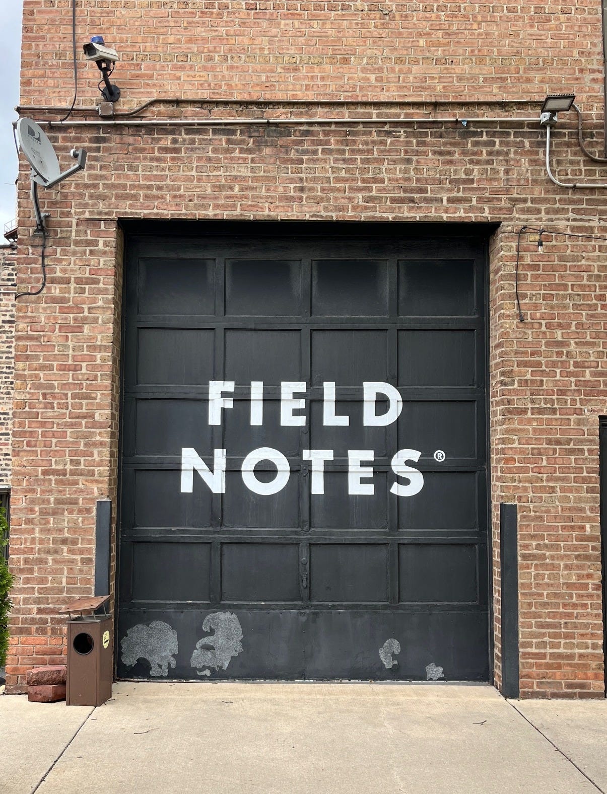
While sipping a tea from COE, I made another quick twenty minute walk to the corporate headquarters for beloved notebook brand: Field Notes, whose products can be found in retailers around the world. All Field Notes notebooks are manufactured in the Chicagoland area, with its offices, studio space, warehouse, and small in-office storefront found near the Fulton Market District in Chicago. The store at Field Notes HQ keeps short, irregular hours, so be sure to email ahead to ensure it’s open for business when you visit. (On a practical side note: the entrance for the store is through the parking lot!!)
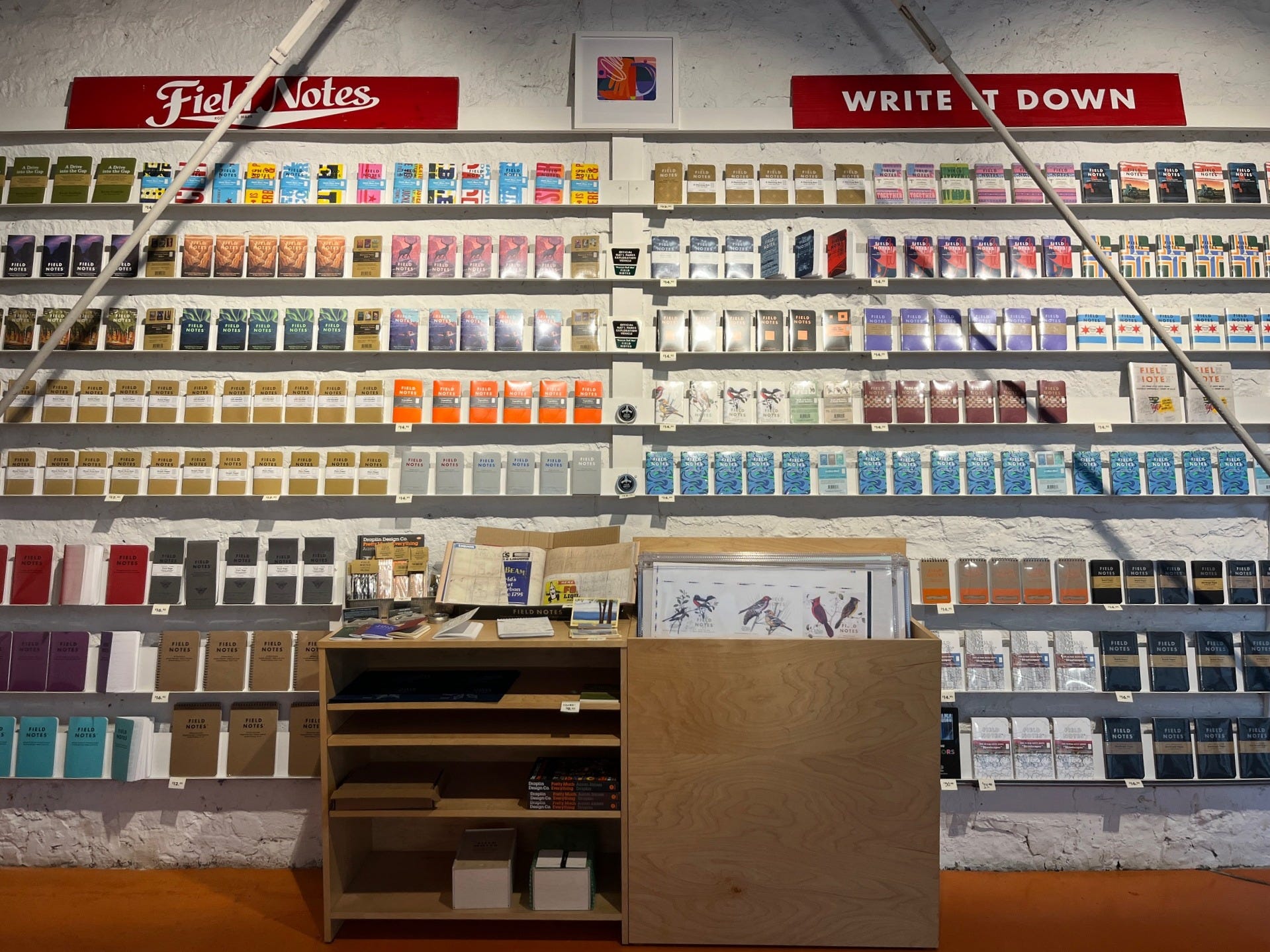
The HQ webpage advertises: “in-person shopping, tours, nerdy printing conversations, and special in-store-only offerings.” After ringing the door bell, I entered the small storefront, which stocks the entire Field Notes product line, including limited editions like the currently sold out Bon Iver collaboration. Press sheets are also on display: poster-sized prints of Field Notes cover designs, ready for framing as stationery-themed decor. Before making a purchase, I was asked if I would like a tour of the offices and warehouse (yes!!!!) an exciting opportunity.


The high-ceilinged, industrial-loft office attaches the storefront to its warehouse, where the packing and shipping of Field Notes products to the rest of the world was actively taking place. While walking through the space, I was given a history lesson on Field Notes, and the story behind several of their notebook designs from a staff member who has been with the company since its inception.
What’s known as Field Notes today, started as Chicago-based marketing and advertising company (Coudal partners), in a joint venture with graphic designer Aaron James Draplin of Draplin Design Co., a prolific designer, whose work fills an entire book, aptly titled “Pretty Much Everything,” (also available in the Field Notes storefront). The inspiration for Field Notes comes from promotional memo books given to farmers by various agricultural companies (seed, feed, fertilizer, etc). Co-founder and fellow paper lover, Aaron James Draplin, explores his own collection of these vintage memo books, rescued from estate sales, and other adventures in “junking” in the short film: From Seed (below).
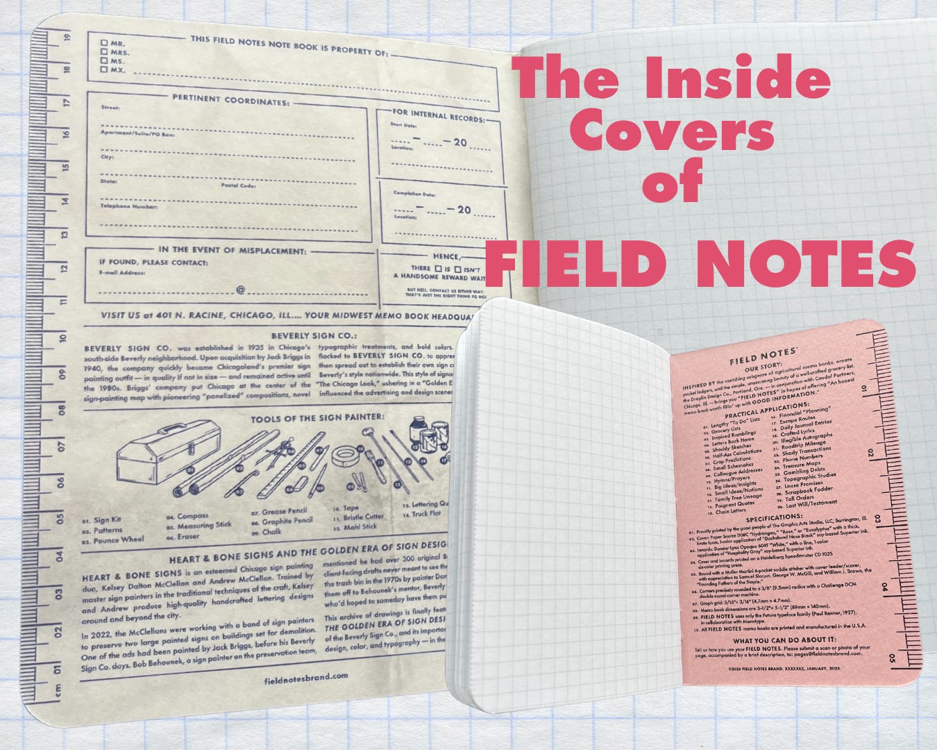
I find this impulse to rescue “the E word: Ephemera”9 , aka these old notebooks extremely relatable. Plastered with branding, but filled with notes, and calculations, these are the diaries of farmers, American histories that should be archived, not thrown away! The collection has been scanned and archived online here, something that makes my heart happy, and provides more insight into the roots of Field Notes. In these old memo books, we can see where the signature shape of a Field Notes notebook comes from. Their inside covers are also modeled on these farmer’s notepads, often including a ruler, specifications of the notebook listed off like film credits, and practical places to write down information “for internal records” - all in the Futura typeface (Paul Renner, 1927).
As a stationery brand with agricultural roots, there’s a certain no-frills, “hardiness” attributed to these notebooks, and I associate them with the outdoors. My imagined use cases are for: notes on birdwatching, construction projects, notes on hiking trails, etc. The type of notebook a Park Ranger, or a scientist might use. As such, the Expedition Edition boasts waterproof and tear-proof synthetic paper. A series of scientific tests, documented in the form of amusing videos, can be found on the product page, where other tests include: fire-resistance, acid resistance, and even ballistics. For best results, the expedition notebook is best used in conjunction with the Field Notes Space Pen, also made for writing in extreme conditions such as zero-gravity, below freezing temperatures, or even under water. As the paper for the Expedition Edition is synthetic, and liquid resistant, it cannot absorb fountain pen ink well, and is best suited for ballpoint pens, or pencils.
At “the heart of their product line,” are the Original Kraft Notebooks, reminiscent of the very first edition of Field Notes notebooks. These compact, 48 page notebooks are available in a left-handed, graph, ruled, plain or mixed paper. New editions, and quarterly, limited releases featuring a variety of cover designs (both inner and outer) are also available. I chose “The Chicago Look” edition as a souvenir, its cover design an ode to said “look,” a design aesthetic attributed to the Beverly Sign Company of Chicago.
Like all product offerings at Field Notes, each cover design is carefully researched, steeped in history, and accompanied by a short film. As a person who loves design, history, urbanism, painting, this notebook cover was the perfect choice for me. Armed with my new notebooks, I walked 30 minutes10 to the next destination to continue my stationery tour of Chicago.
Atlas Stationers
📍 227 W Lake Street (Downtown, Chicago)
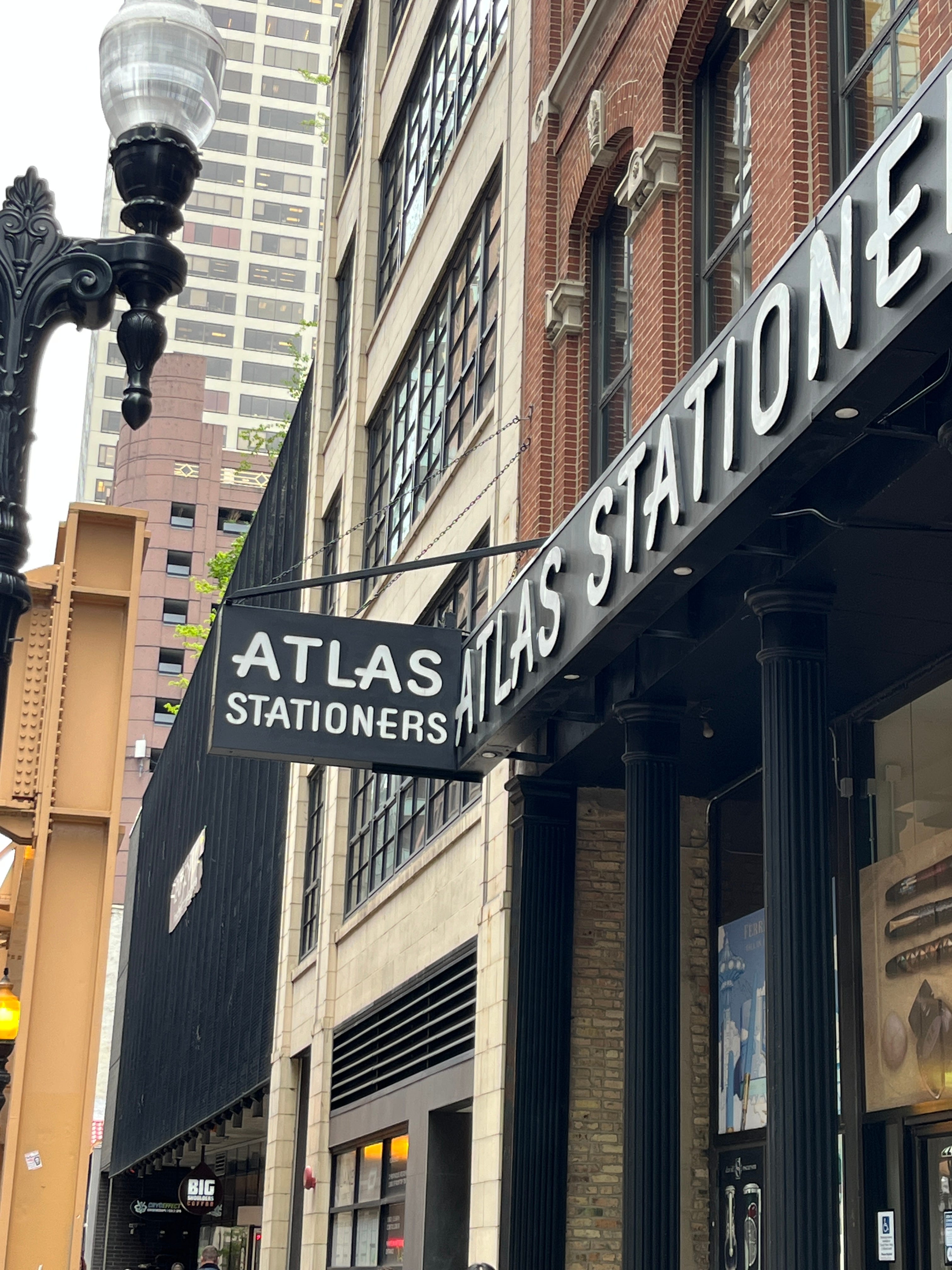
The L train periodically rumbles by Atlas Stationers in downtown Chicago, a large and spacious shop with aisles and aisles of stationery and art supplies. Family owned and operated since 1939, Atlas stationers runs both a lively storefront, and a popular online retail shop, boasting a stock list of over 1400 different types of bottled inks. Many of my friends order their fountain pen supplies exclusively from Atlas, and as I explored the shop, it was easy to see why.
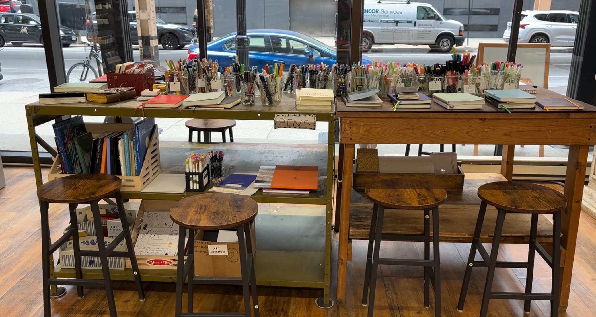
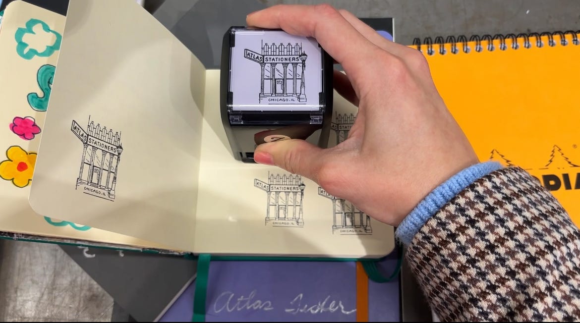
The front of the shop hosts a pen and notebook testing station, where shoppers can test out different fountain pens, brush pens, highlighters, ballpoints, colored pencils, finetip markers, and more, on their choice of notebook. Also of note on this table are the storefront stamps, self-inking and rubber, ready for use in your travel journal.
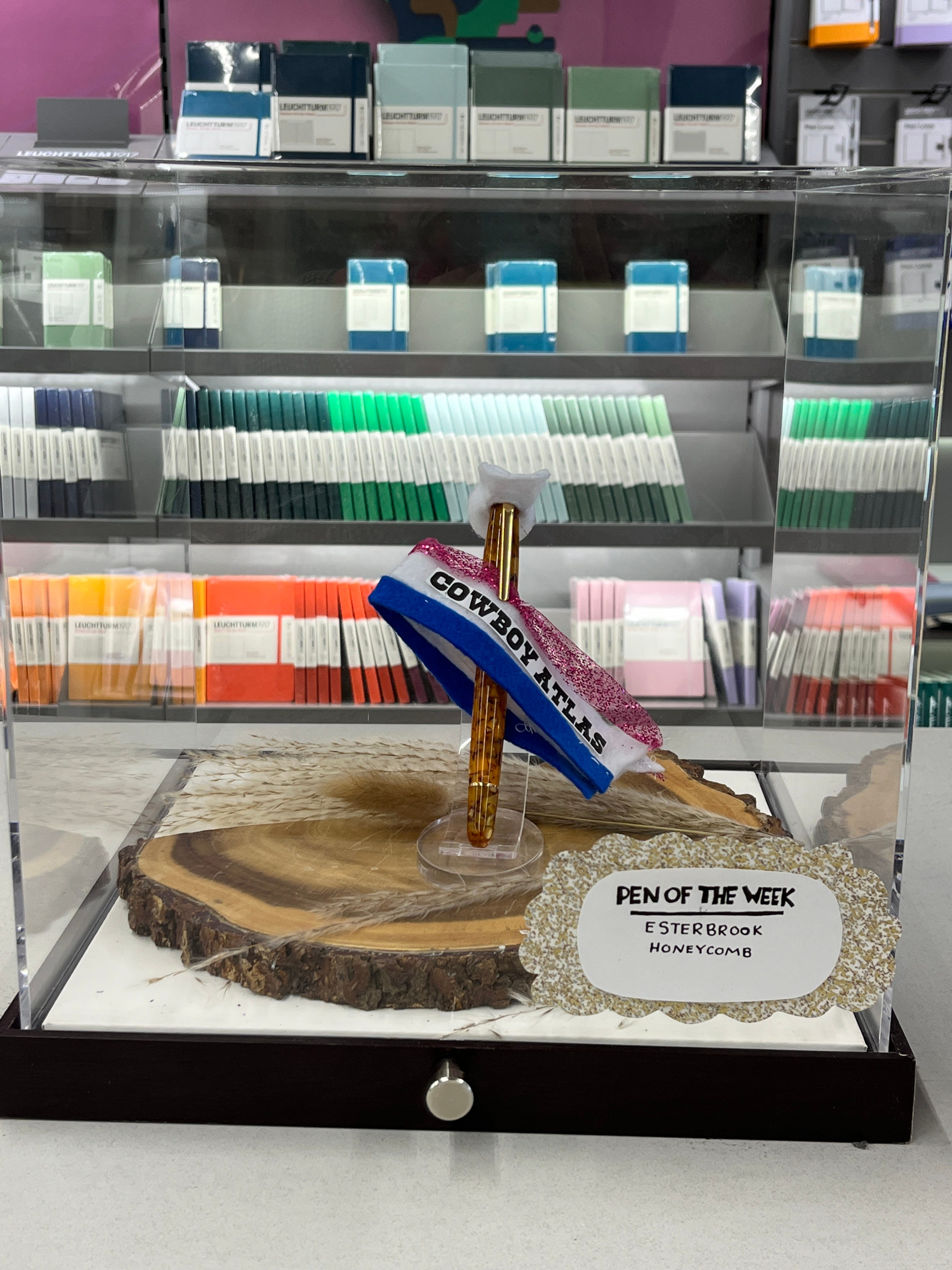
Glass cases filled with fountain pens greet you on the left side of the shop, the aisles of inks are in the middle, and notebooks and other supplies can be found on the right. Catering to fountain pen fans, a large selection of Clairefontaine notebooks are visible at the front, known as some of the best paper for fountain pen inks. Delfonics pouches are plentiful, well-known staples for storing fountain pens upright. The “pen of the week” is on display at the front, this edition appropriately dressed for Beyoncé’s Cowboy Carter tour, which had taken place in Chicago the week prior.
Binders of ink swatches and a truly mind-boggling amount of ink bottles and cartridges line the shelves, solidifying Atlas’ reputation as a veritable fountain pen destination. Upon this realization, I decided to dive in and buy my very first fountain pen, this seemed like a good place to do it.
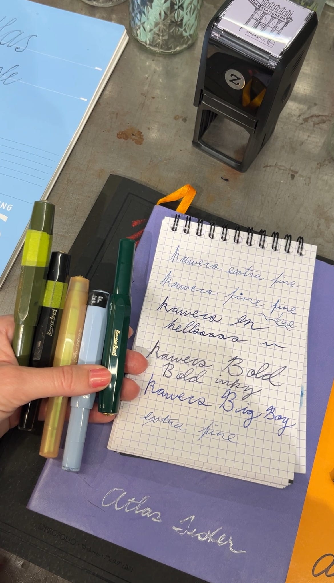
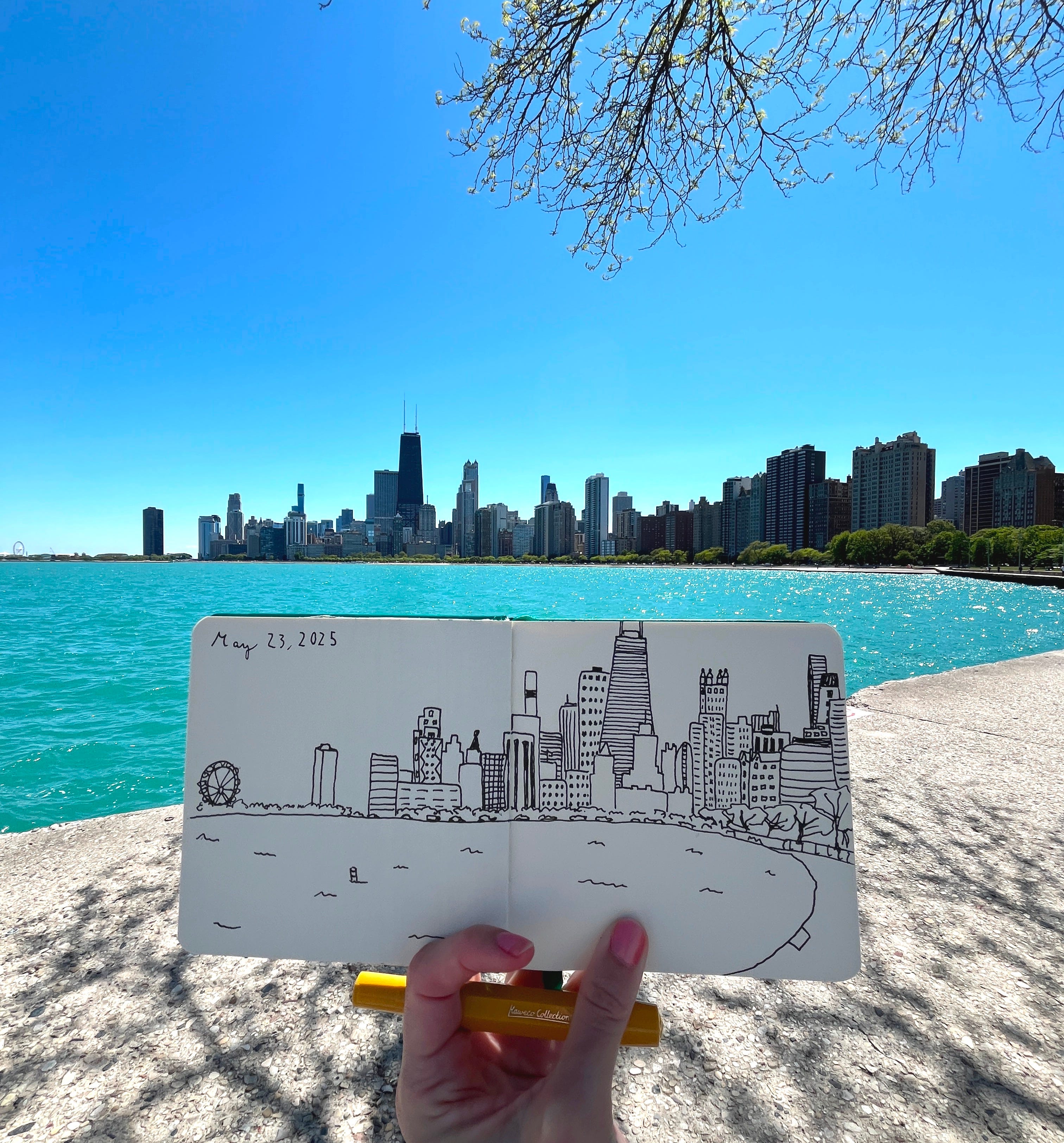
Surprising, I know, that as a person who runs a stationery blog, I don’t already own a fountain pen, but I’ve long been intimidated by all of the moving parts. Stationery lovers know, there are many different niches to explore, I still have wax seals on the back log, but fountain pens have been at the forefront of my mind. I had been harboring a developing interest in a Kaweco pen, which seemed to be reliable, affordable, beginner friendly, and most importantly, comes in a bunch of different colors. After consulting with the knowledgeable staff, and testing the different nibs at the pen testing station, I settled on an inky, medium nib. The beauty of a store this well-stocked is that all pens, in all nib sizes and colors are available, the glass pen cases stretching all the way back of the shop, not unlike a jewelry counter at a department store. I chose a yellow, Kaweco collection pen from the rainbow of colors on display.
As a watercolorist, I asked for a recommendation on archival quality ink, best for artwork, and combining with water-based mediums. I then learned that this type of ink is only available in bottles, and not the pre-filled cartridges I had hoped to purchase as I got used to the pen. After making my purchase, the staff graciously gave me an in-store lesson on using the converter to fill the pen with ink. This level of personalized service is what makes Atlas the premiere fountain pen destination.
An Art Museum Interlude:
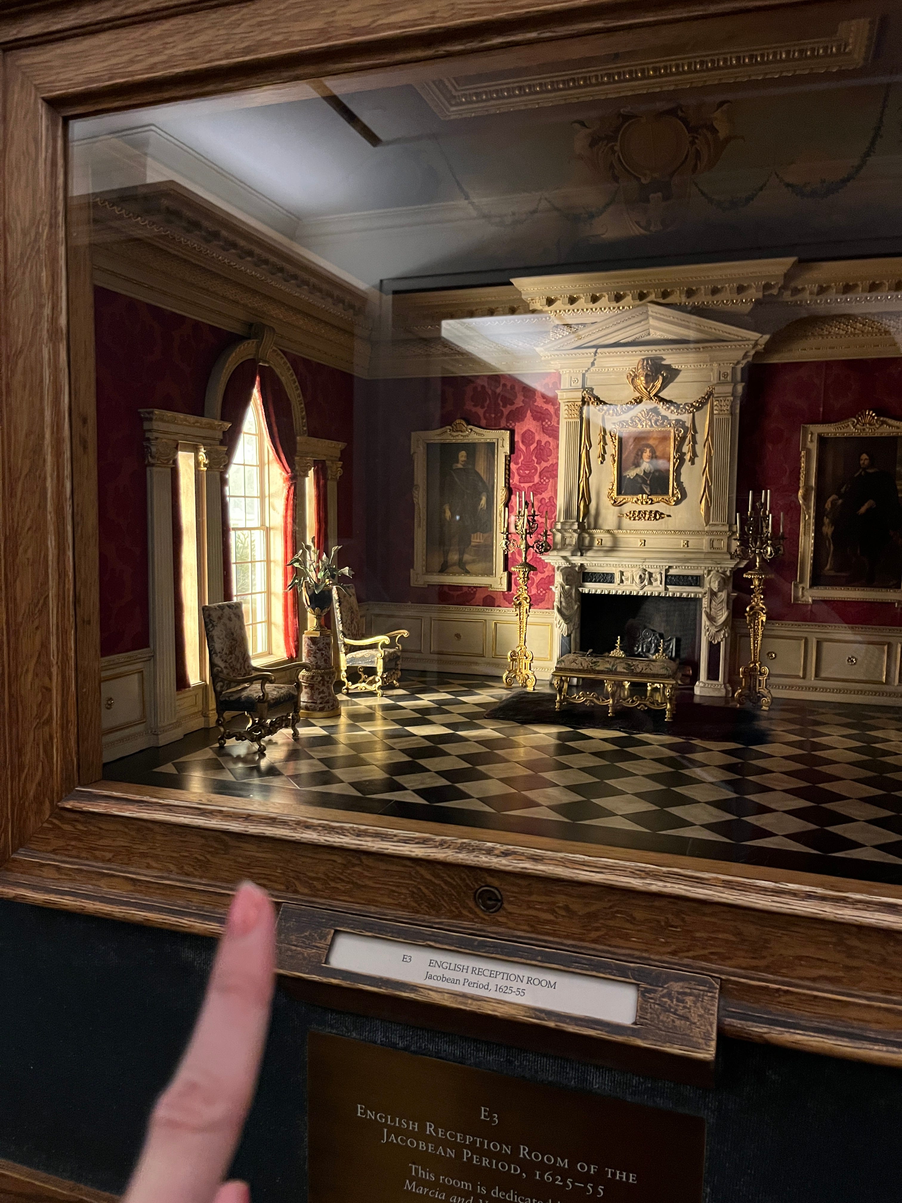
I finished the day at the Art Institute of Chicago, open until 8pm on Thursdays, and wandered the halls and the truly robust collection of paintings on display. An exhibition on Frida Kahlo and her friendship with Mary Reynolds was of special interest to me, as Mary Reynolds was a master bookbinder, and many of her book-binding works were on display. After seeing much of the museum’s collection, I then headed to the basement of the museum, where the Thorne Miniature Rooms are found.
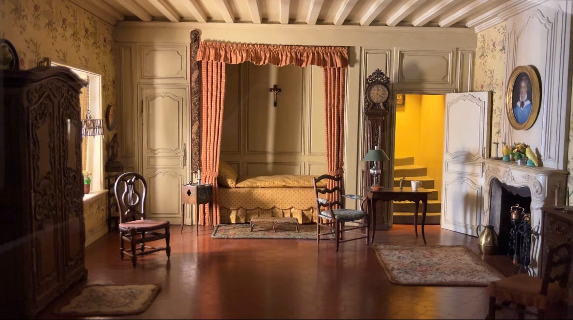
A favorite of mine, 68 tiny reproductions of a wide range of interior styles are on display at eye level. The lighting design in each tiny room is incredible. Staircases, alcoves, and hallways add such realistic dimension . Each diorama is like a picture I want to jump inside of! I dream of miniature living rooms and giant mango tarts.
Part II: Another Longanisa Breakfast
My next and last stationery stop was in Andersonville on the North Side of Chicago. To keep the Filipino-Chicagoan breakfast streak going, I went to Del Sur Bakery, and read another small chunk of my book before ordering some incredible pastries.
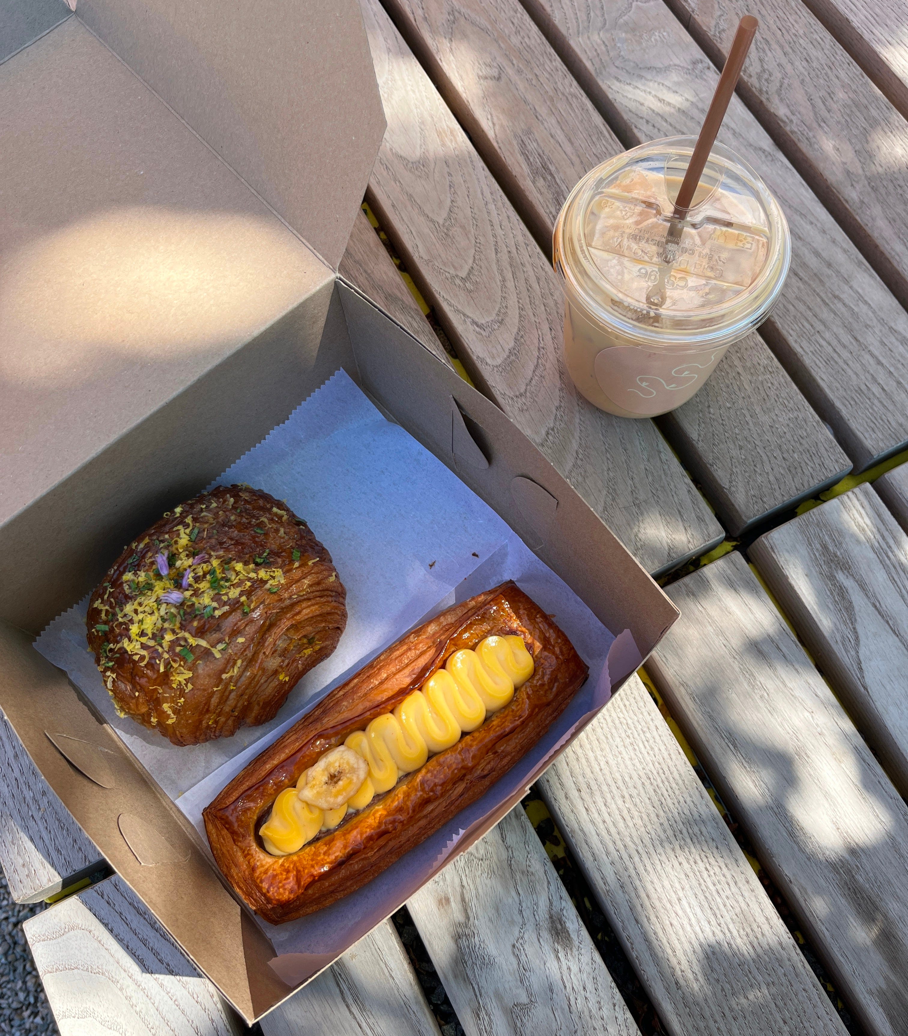
Del Sur is also known for its long lines, but these pastries are in demand for a reason! I found the Longanisa croissant to be a work of genius, the flaky, buttery, layers of the croissant hugging the Longanisa not unlike a giant pig in a blanket. To balance things out, I ordered a banana danish, which a dreamy dessert. I walked this off with my iced coffee, taking a 30 minute stroll to the next destination.
Paper & Pencil
📍 1480 W Berwyn Avenue (Andersonville, Chicago)
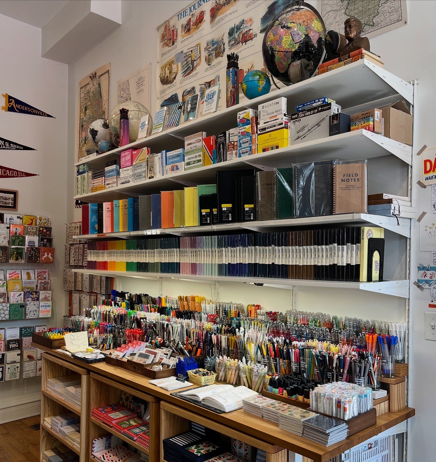
Billed as “your friendly neighborhood stationery shop,” Paper & Pencil is an extremely charming shop in the equally charming neighborhood of Andersonville. Owned by local neighborhood residents, Tyler and Eric, the shop has been in business just over 2 years, and has since amassed a cult following.
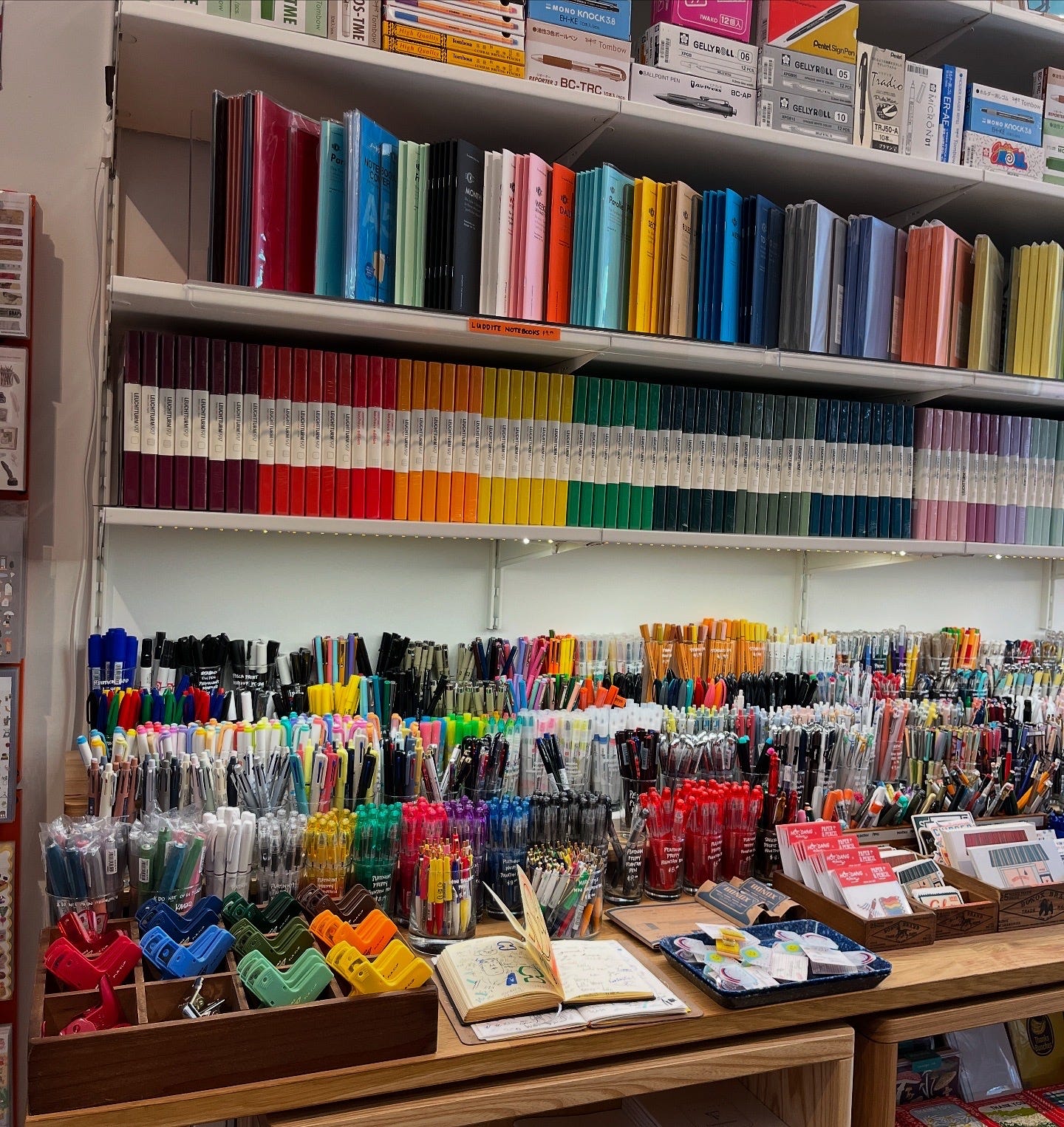
The styling in this store is delightful, the nostalgic decor of posters, globes, and lamps evocative of a an elementary school classroom, reminiscent of the days of school supply shopping. The crown jewel of the shop, oft-featured on their Instagram account (which is super fun btw), is the writing tool and notebook display at the front. A beautiful cornucopia of supplies, including those very useful Penco clamps for holding notebooks open! I spotted and purchased the Uni-ball One gel pen in the color “Papaya,” which I love so far, and I think will be my new purse-pen (its chunky shape makes it very easy to find)!
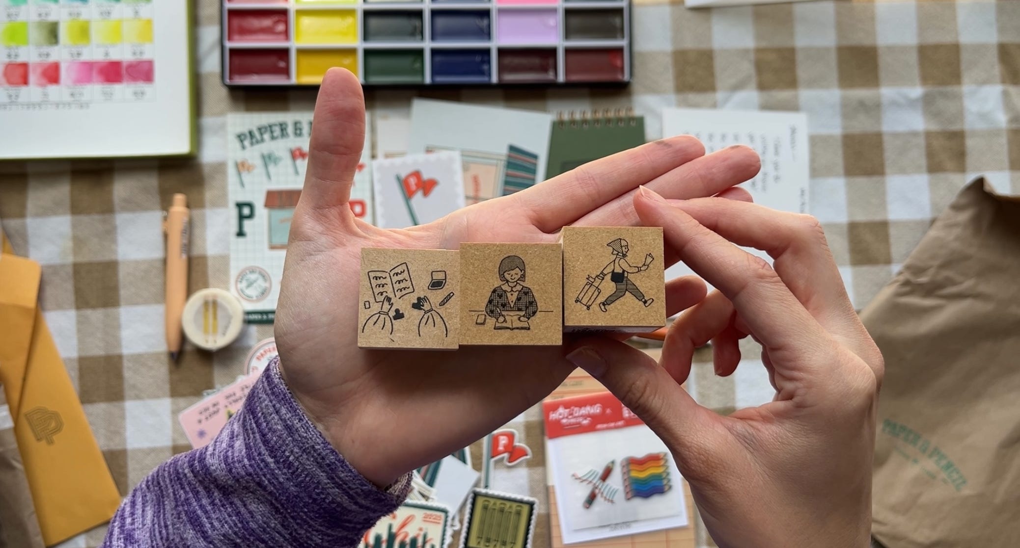
Tyler and Eric’s passion for stationery can be felt through their lovingly curated selection of products. Paper & Pencil is a shop that’s truly for stationery lovers, by stationery lovers. Stickers from local artists, wax seals, fountain pens, playful memo pads, nostalgic postcards and an enchanting display of stamps in a printer’s drawer can be found in the shop’s many corners. Each alcove dedicated to the many and varied niches of stationery. I haven’t had an impulse to purchase new stamps in a while (I have a lot), but the three I went home with (above) were very much aligned with my whole journaling and traveling thing. Each item in the shop “sparks joy,” and the staff is wonderful and knowledgable. Paper & Pencil must be experienced in person, a destination shop and wonderland for those who love stationery.
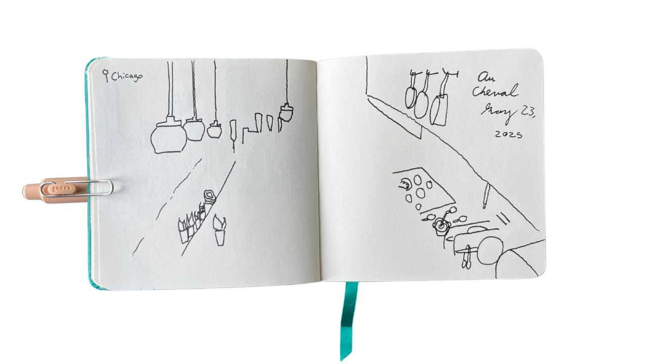
I headed to High Five Ramen for one last wait in line. I was then told it would be 90 minutes, but I was hungry, so we conclude this trip with an unfinished sketch of the exposed kitchen at Au Cheval, where I was weirdly seated quickly, with great view at the bar. I then stopped drawing because my food came. A cheeseburger, of course. The cheeseburger of dinner foods.
Bonus Shop: The Minnesota Center for Book Arts
📍 1011 Washington Ave S #100 (Downtown Minneapolis, Minnesota)
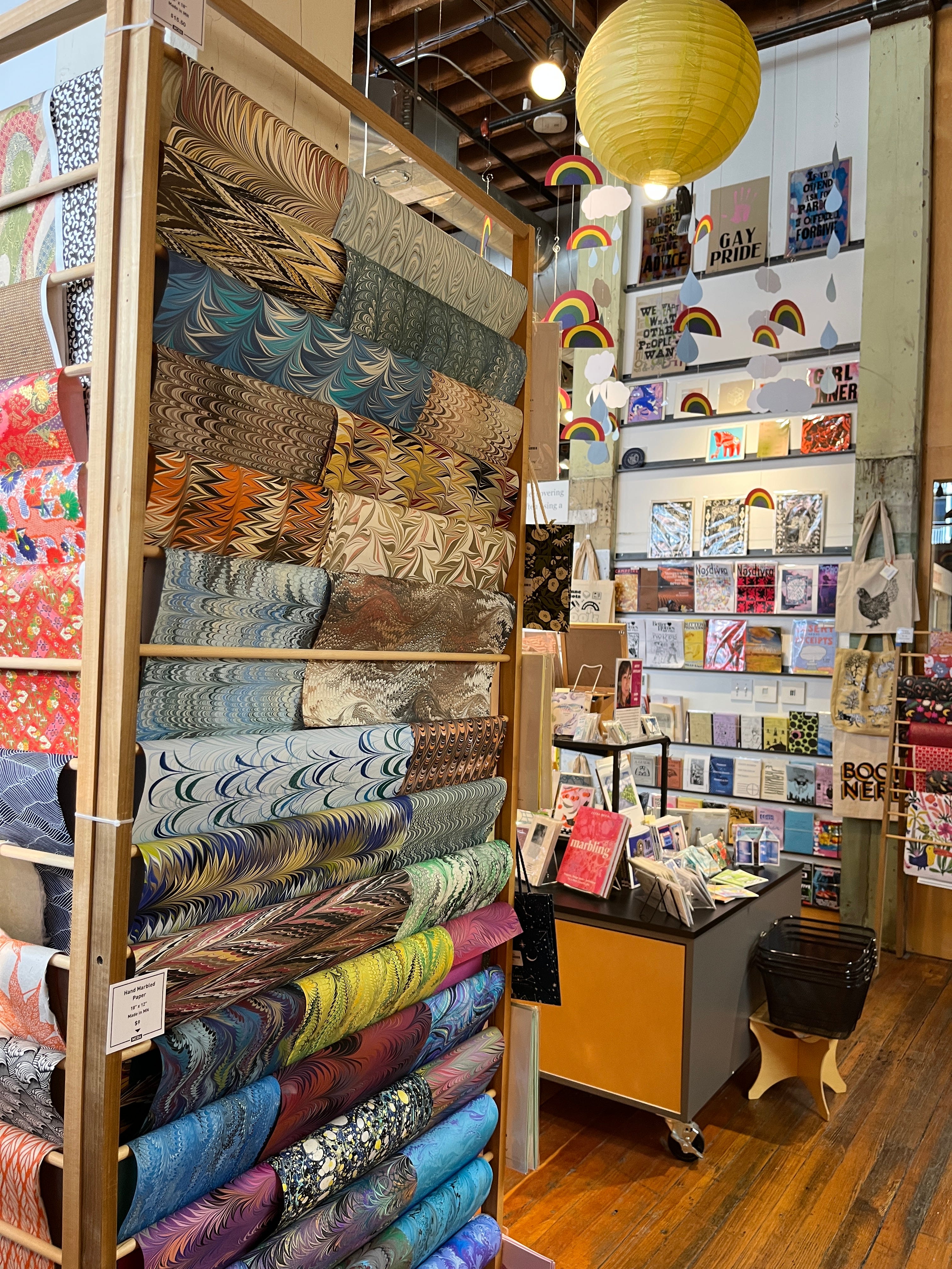
Another Midwest pit stop while visiting my family in Minnesota. The Minnesota Center for Book Arts is home to: a stationery/art supply/zine shop, an independent bookstore, a cafe and community space, a gallery, and a number of classrooms and studio spaces used to teach and practice variety of paper arts, such as: bookbinding, paper making, printing, hand-lettering, and more.
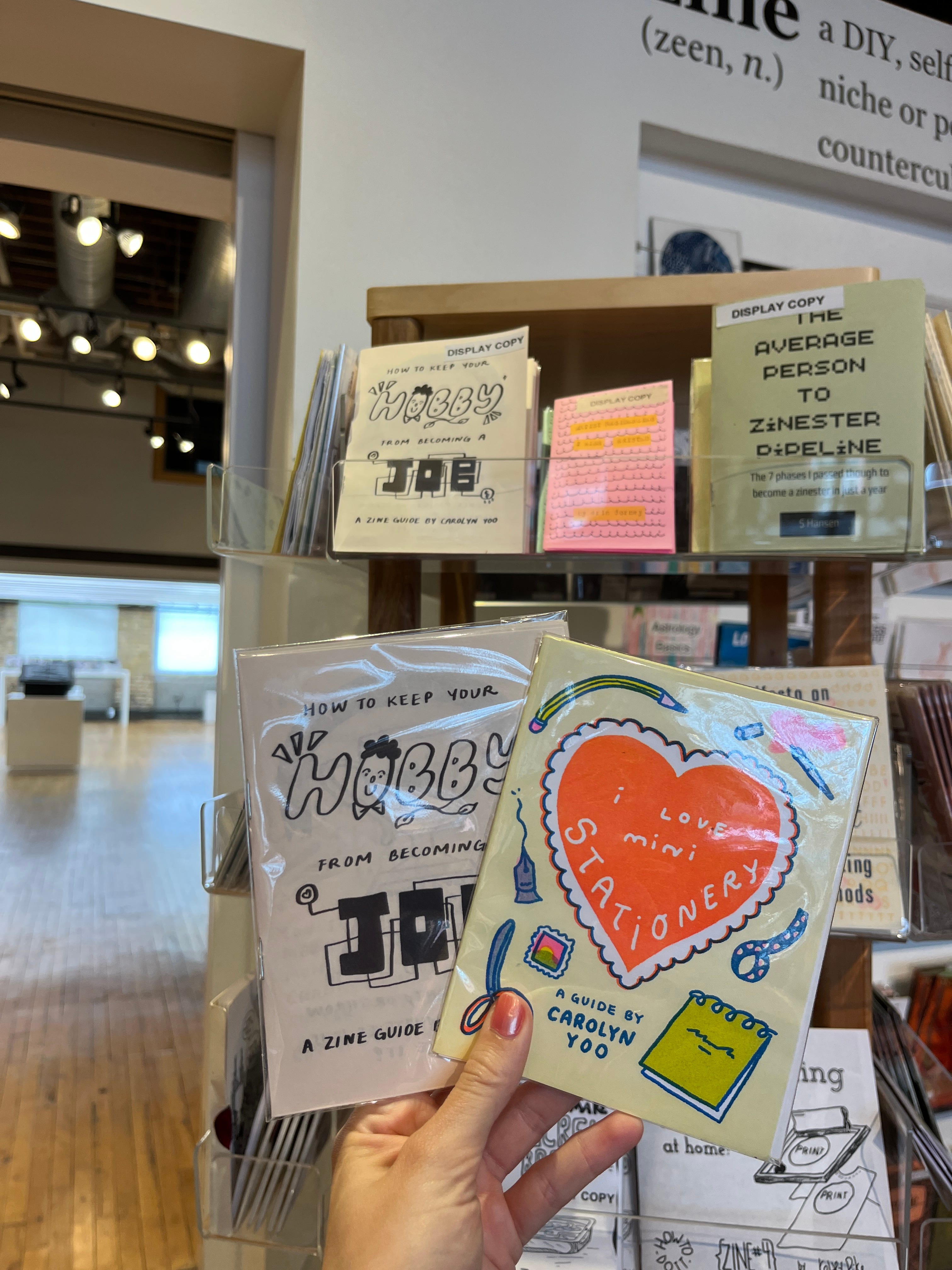
Substack mutual, and fellow artist, Carolyn Yoo has published a few zines, which were available in store, alongside HUNDREDS of zines from artists around the country. So exciting to see her work in print and in a shop!! Also available: prints from local artists, handmade paper, specialized bookbinding supplies, and an array of interesting notebooks. A lovely shop and community space to visit if you’re in the Twin Cities. My dad went hobby-for-hobby with me, then taking me to one of his hobby supply shop pit stops:
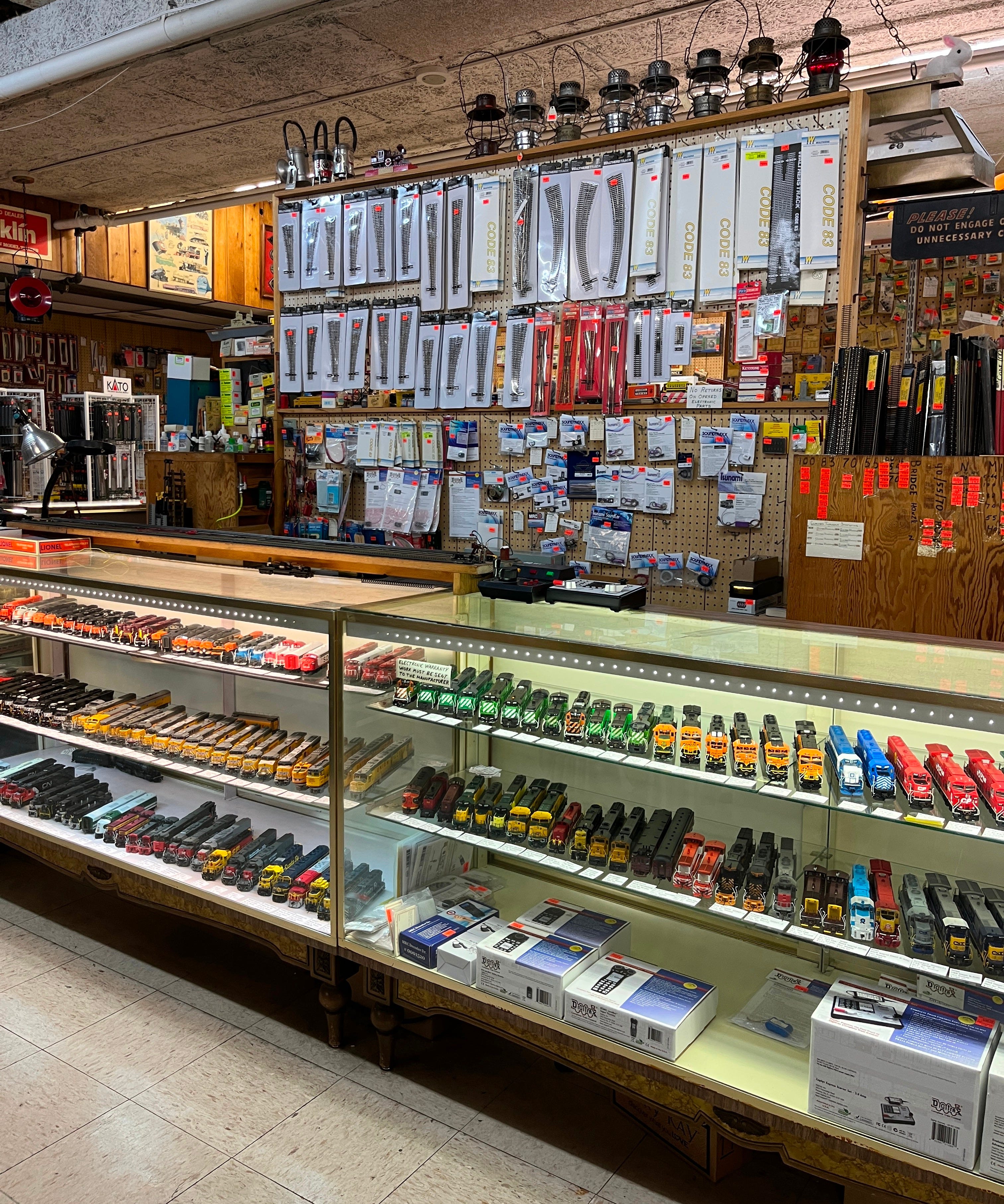
an enormous model railroad supply shop, a photo of which he thought I might like to feature on this midwestern stationery report. Why not. Choo choo! 🚂
Beyond the Paywall:
A Google Map featuring the shops, restaurants, and other points of interest featured in this guide.
A master list of shops to easily copy+past into your notes
++ a pretty itinerary!
Keep reading with a 7-day free trial
Subscribe to Journaling Dan to keep reading this post and get 7 days of free access to the full post archives.